Field Automation
Emvisage is the answer for organisations struggling with complex, high consequence field workflow. Our software automates even the most challenging workflow, super fast.
Request a live demoSpecialised in complex field workflow
We help your field service organisation digitise paperwork, streamline workflow and automate. This frees teams from mundane admin, transforms productivity and ensures an outstanding customer experience every time.
Watch the video and find out how Emvisage can work for you.
Automation drives productivity through your field service organisation
Automation is at the core of everything we do. The deep customisation of our low-code platform powers game changing automation, even where automation seems impossible.
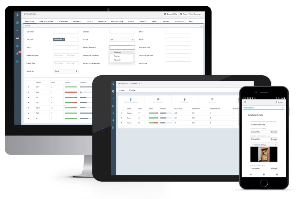
X-Smart forms let your field team easily handle job documentation and safety paperwork on their mobile at the customer’s premise.
Stop doing manual work and reduce paperwork up to 50%!
Your back office gets real-time insights on the job and benefits from automated job reports directly sent to your customers.
Cut email volumes by up to 75% as checks and rechecks are not needed.
Custom forms and workflows ensure that information that needs to be captured is not missed. Never fear an audit again.
Problems on site and quality issues are reduced by up to 75%.
Individual Customisation
Customisation and configuration are close to our heart. 95% of the software is aaptable and therefore always the erfect fit for any organisation.
Fast Implementation
Emvisage is fast and frictionless to implement, thus improviing your workflows in no time.
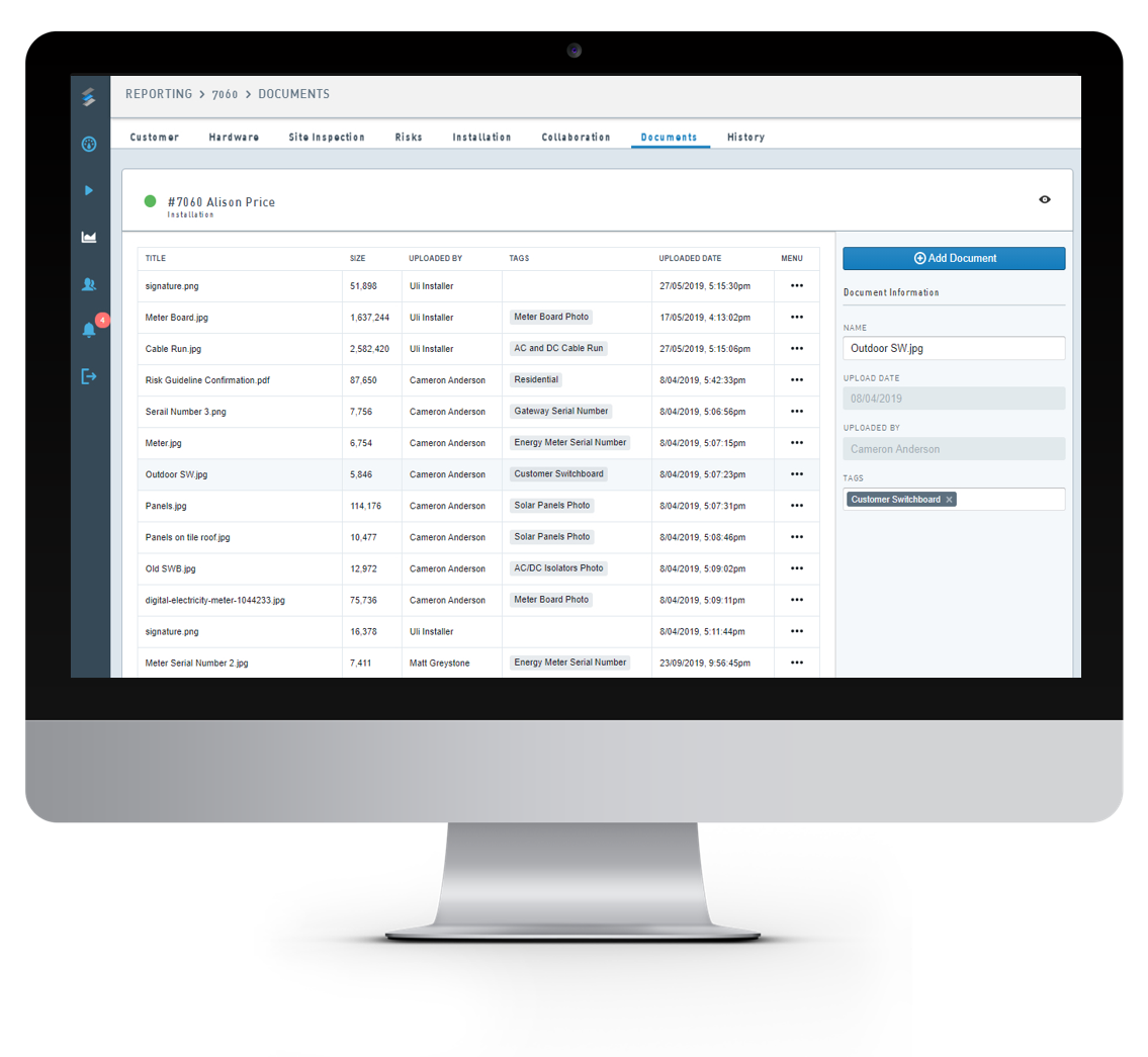
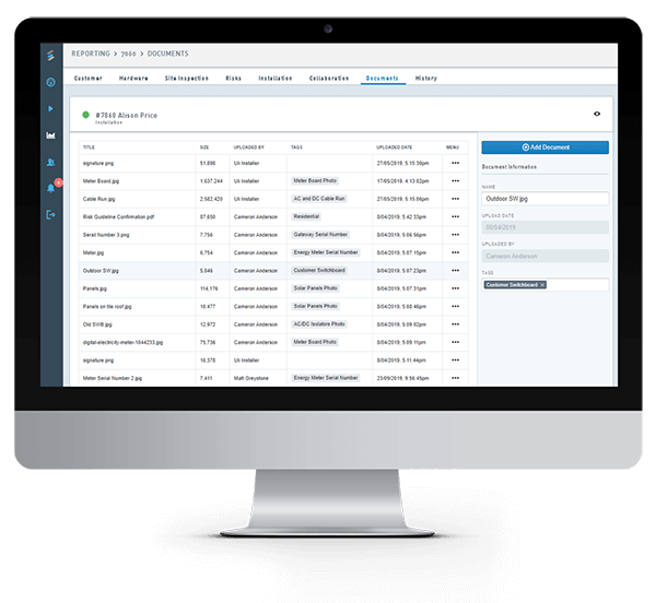
Single Source of Truth
We think holistically. Track everything in one place instead of running on spreadsheets, paper and email.
Calculate your savings with Emvisage

JET Charge